The Option Smile
 Most concepts in options relate back to this simple concept we will discuss today. Today I hope you will join me in tackling this complex subject, throwing in a few visuals, and together we'll entertain the learning minds of thousands. It just so happens that every Monday morning I teach a lesson on Options Pricing & Volatility. This breaks away from the focus of different strategies to enhancing the understanding of how options are priced, how different strikes are sensitive to different variables, and gives the trader more knowledge of how options work. This allows them to better comprehend which strategies are most appropriate and when.
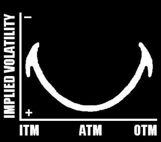
My motivation for this post came earlier this morning when my understanding of options was challenged. While I don't claim to know everything, I claim to try and teach everything. So allow me to teach you a concept that I probably know nothing about :) Take a long look at this graphic below...
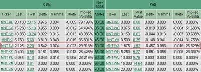
 It's that easy! This graphic ought to explain how ATM options wind up with the most time value, the highest theta, the highest gamma, and the highest vega. As the option becomes increasingly ITM or increasingly OTM, you can see how volatility (and the greeks) become less sensitive or their valuations get smaller. Here is another graphic I want to include. Below is an option greek chain on a stock that was priced at $50.02 (This was the closest I could get to a round number).
Looking at this chart, you can see the truth behind the volatility smile. I think it is a great way to visualize how this works. Looking at the 50 strike, which is ATM, notice how it has a higher time value, gamma, and theta than the rest of the options. As you go further OTM or further ITM, notice how the values get smaller. This is where the smile starts to curve upward and helps to illustrate this concept.
That is all there is to it. This graphic is a great tool to illustrate what I spent hours teaching in my class. Looking at the smile, you can start figuring out..."If my option becomes ITM, how sensitive will it be to volatility?" "If I have an OTM option, and it becomes ATM, how will the time value be affected?" I will start using this graphic on the presentations to answer questions during the Q&A. Just a quick glimpse will help to answer many questions traders have about option sensitivities.


Great illustration Jeff! A visual makes a world of a difference. This is my first post on your Blog, keep up the good work! I usually listen to your master talk recordings, ill have to catch a live one soon.
Posted by Anonymous |
10/03/2006 09:28:00 PM
I must be thick, but that seems backwards to me. Seems like the smile shows IV being lower/smaller ATM and higher/greater OTM and ITM.
I've always understand that IV is greater ATM, but this smile has never made sense to me. Am I looking at it wrong?
Posted by Anonymous |
10/04/2006 03:49:00 PM
Jeff,
Clear as mud. I thought I understood it then as I re-read it got confused.
The issue is the graph and the definition of Implied Volatility. On the Chart, is Implied Volatility actual referring to "the impact of implied volatility as it rises" or is it "rising implied volatility". And on the chart regardless of definition, which direction is Implied Volatility moving as you go from bottom to top?
The chart implies rising or falling but doesn't indicate the direction.
So you lost me on this one completely.
Mike H.
Posted by Mike |
10/06/2006 09:58:00 AM
Sorry if you feel lost. There are plenty of books & resources on the topic if you'd like more detail. I would have liked to go deeper into the subject, but then again anything I can offer is more than I have time for and worth it's wait in gold since it is free. I added a "+" and "-" to the image to help. If that doesn't work, perhaps the other readers that understand it can forward some suggestions, or add a few comments.
Posted by Option Addict |
10/06/2006 10:26:00 AM